Typically, I design features and flows to maintain a cohesive experience for users and fit-in to the products’ existing visual design, but occasionally I have the opportunity to focus on improving the way a product looks.
At Findhelp (previously Aunt Bertha), I had the opportunity to work on several projects that were primarily aimed at improving the products’ user interface.
Helper Page Redesigns
Findhelp.org connects people in need with services that can help them. People who assist those in need, internally called “Helpers”, use a pair of pages to find and interact with records for specific individuals they are working with.
Profile List Improvements
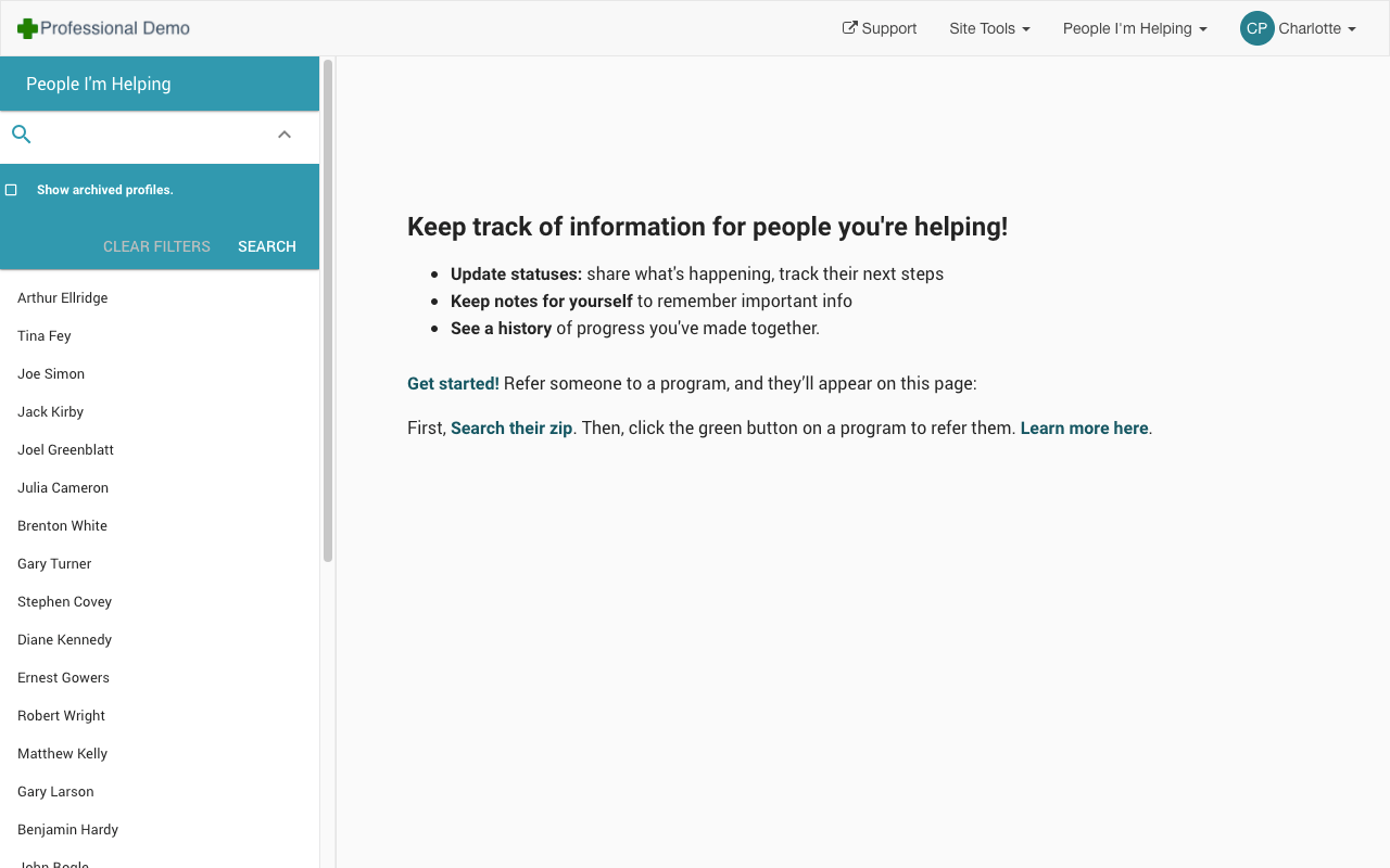
The People I’m Helping page lists individuals a Helper has access to, and was designed before I joined:
The majority of the People I’m Helping UI was dedicated to displaying a static message, while the list of individuals a Helper had access to was tucked away in the left column.Very few profiles could be seen without scrolling when the page loaded if the customer had access to many filters.
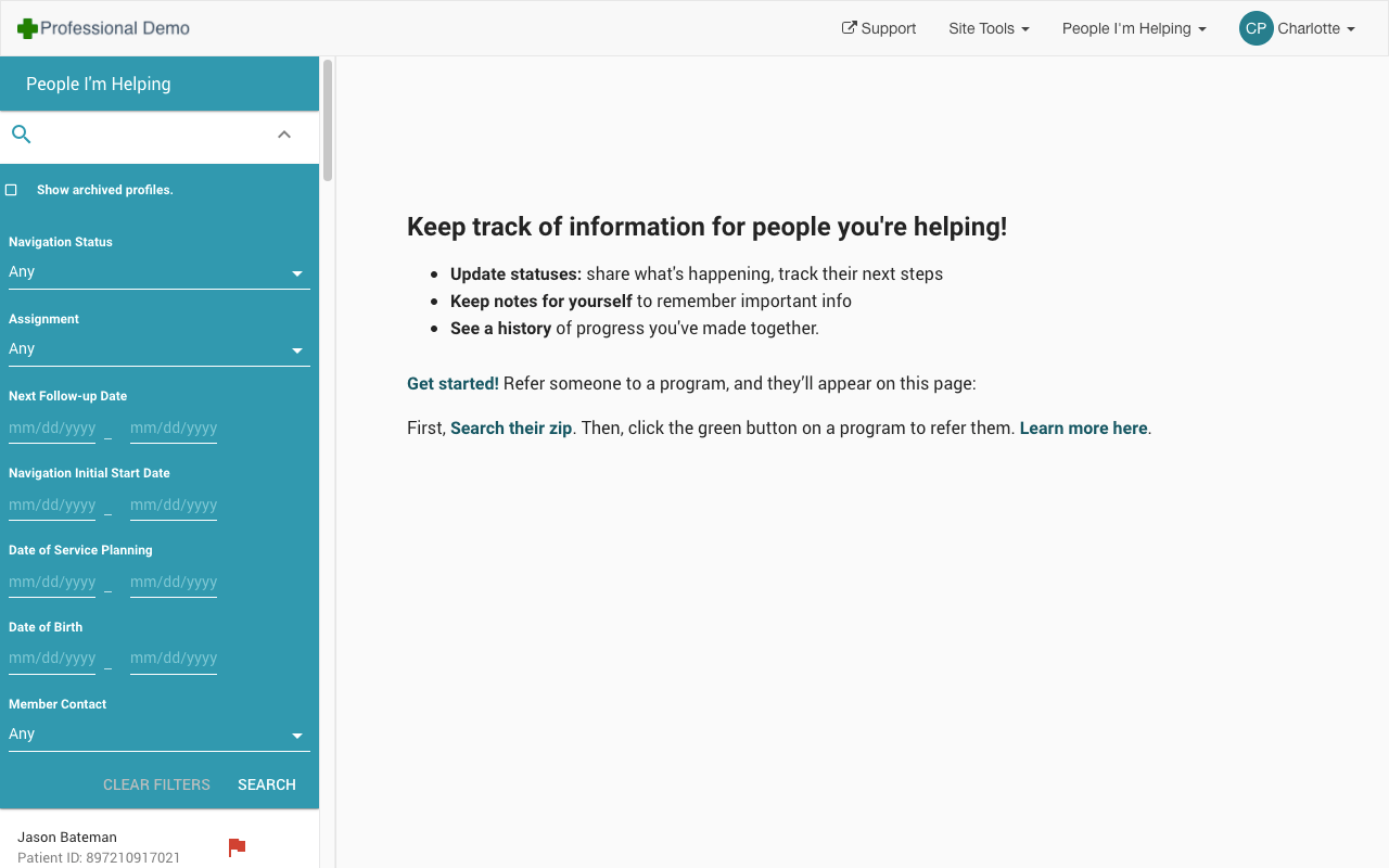
When the page was rebuilt to improve performance, the Product Manager driving the project agreed to update the UI to my new design, which dedicated the majority of the space available to displaying content, allowing Helpers to get useful information without navigating to the profile.
New Updated page design displays relevant profile information front-and-center in a table. Filters are displayed in their own column and don’t impact how many people can be seen.
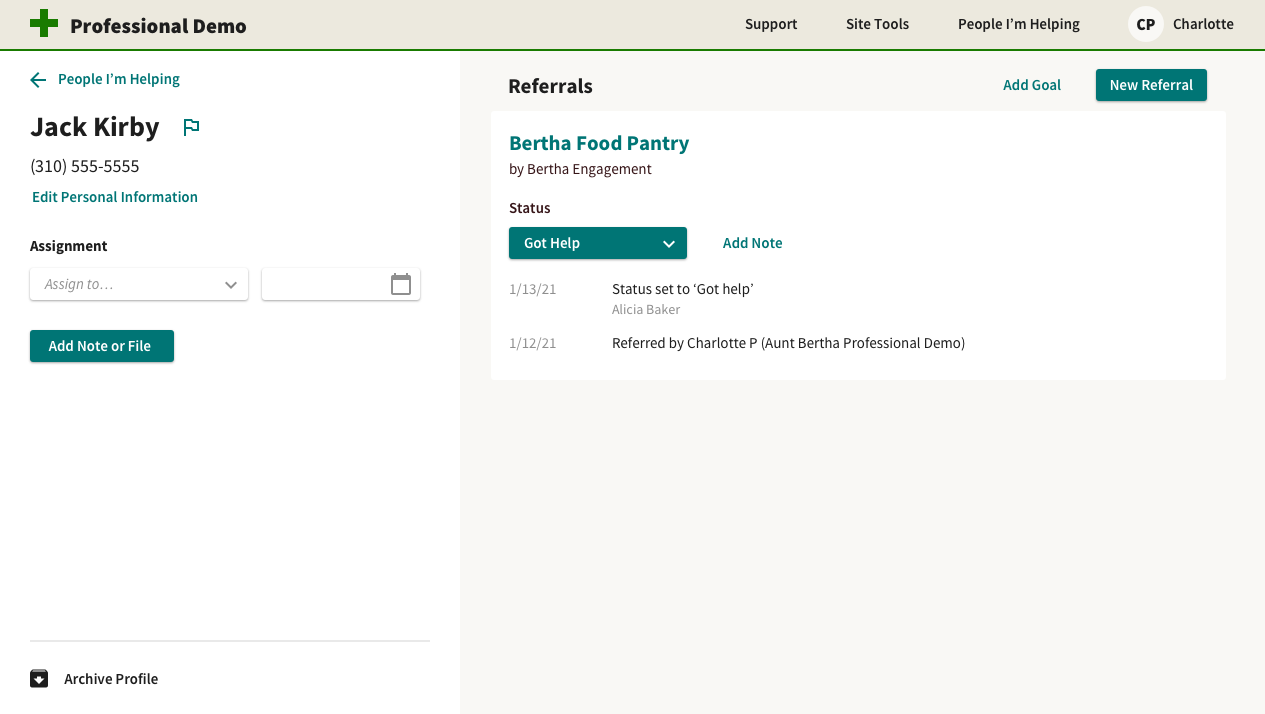
Profile Improvements
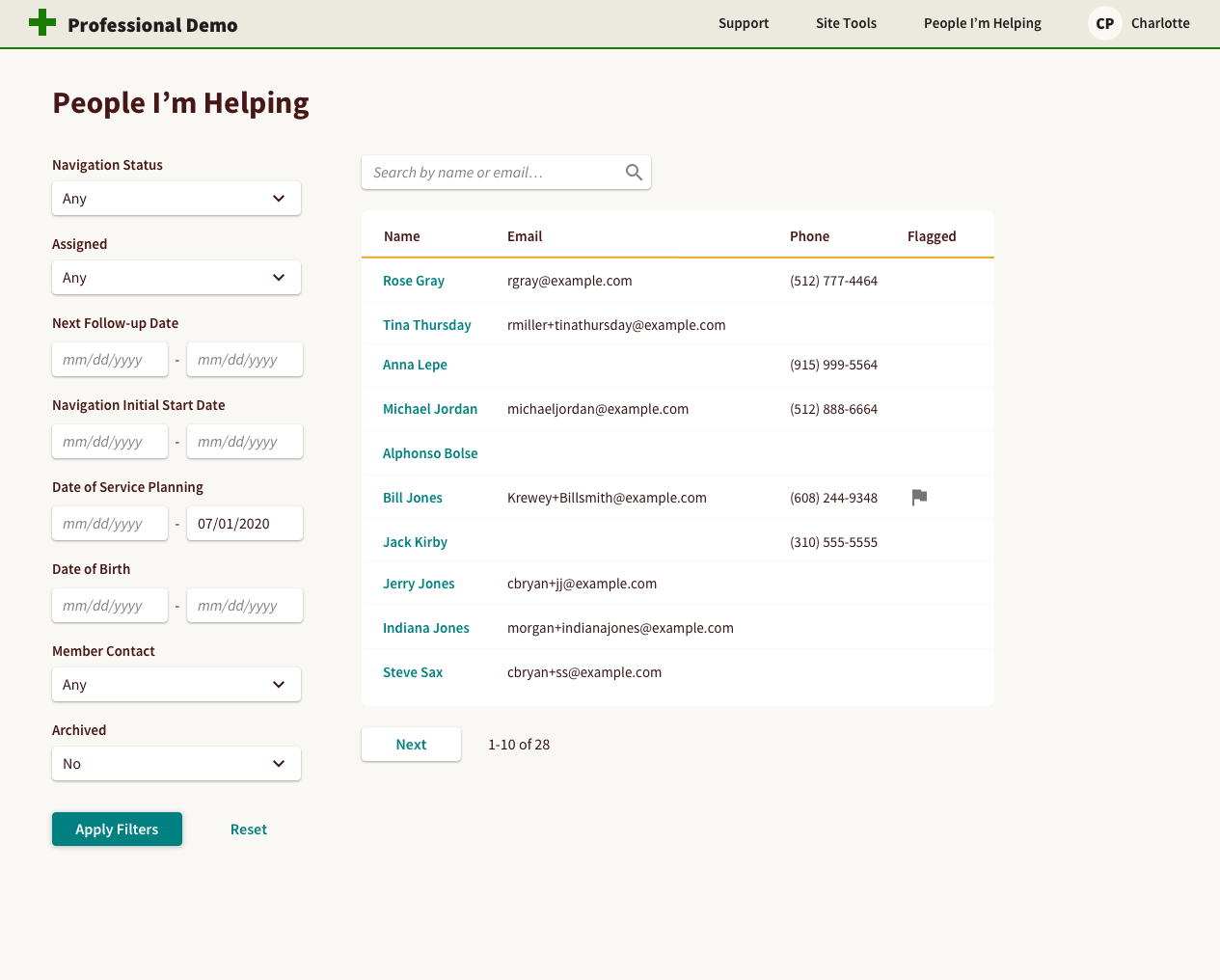
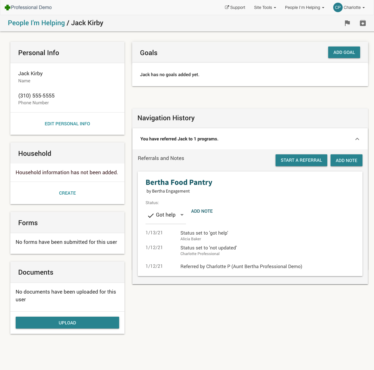
Clicking on a persons’ name navigates Helpers to the Profile page, which displays detailed information about the individual in a series of Material Design styled Cards that resulted in content appearing at the same level of importance.
Infrequently used controls and empty sections were also displayed, making it difficult to quickly glance at the page and understand what was being presented (in this case, a person referred to a single program):
An example profile for a Seeker with one referral to the “Bertha Navigation - DEMO” program.
I redesigned the Profile page to remove unnecessary elements and simplify the display of information. This design hadn’t shipped by the time I left, but was presented to PMs as a future direction for the page, and informed additional improvements.
New Redesign focused on reducing visual information and establishing prominence for high-value functionality
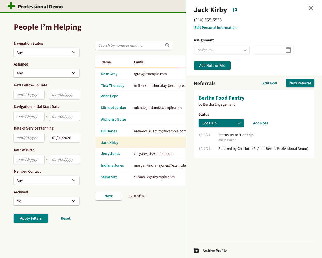
Finally, a common workflow was to view a list of individuals and work down the list, navigating from list to profile, back to list, next profile, back to list, etc.
It was common for Helpers to repeatedly navigate between list and detail pages.
Instead of constantly navigating, I recommended we bring the content to the user. I created a design that displayed a mobile view of the Profile in a sidebar directly on the Profile list page, decreasing back-and-forth navigation and reusing code.
New Sidebar added to the Profile list page allows Helpers to perform common actions without leaving the list of relevant individuals.
This direction was approved and had been partially implemented by the time I left.
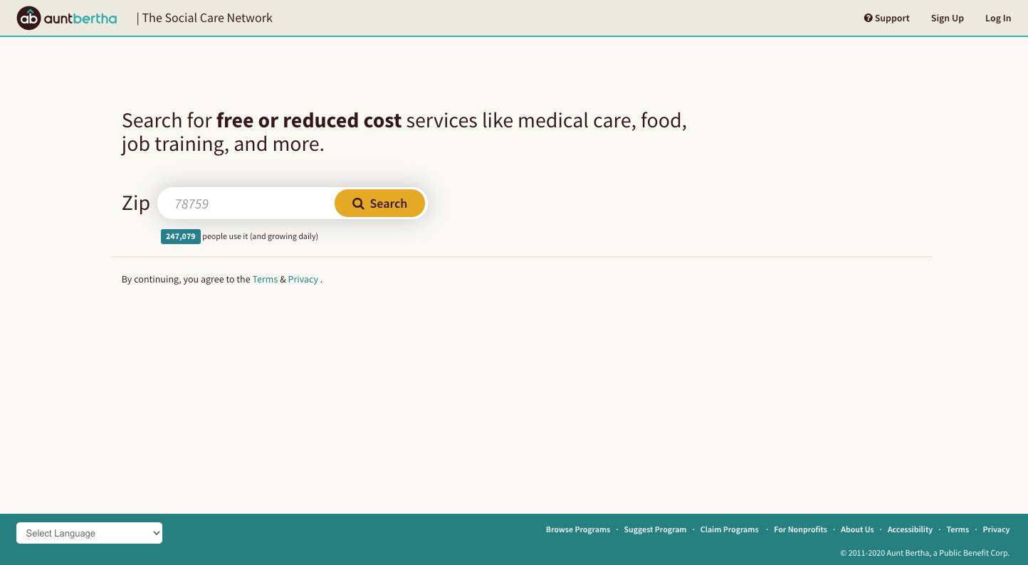
findhelp.org Theming
Before the company’s name change, Aunt Bertha (later Findhelp) worked with an external design firm to update the company’s brand and redesign the marketing site:
Updated Marketing site design by outside design firm
Company leadership wanted to launch the marketing website with updated branding and apply similar styles to main website at the same time. This required a quick turnaround and wasn’t included in our quarterly planning.
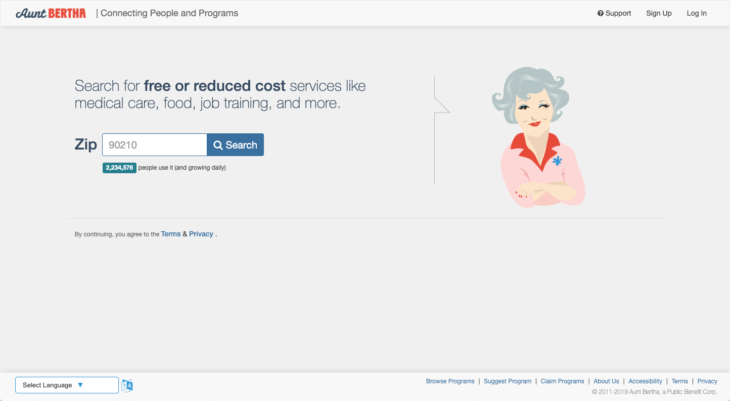
Previous homepage design prominently featured an illustration of Aunt Bertha
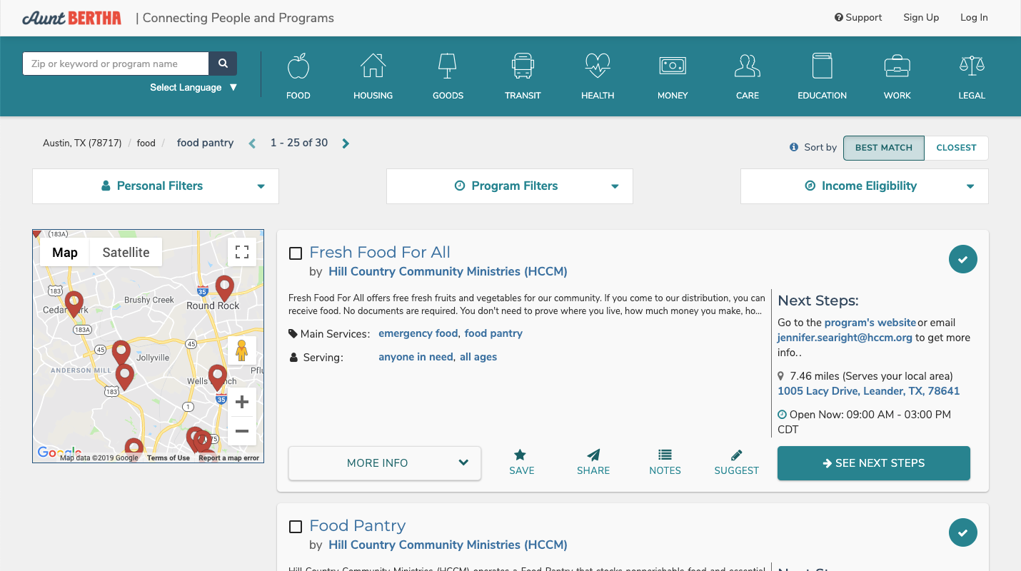
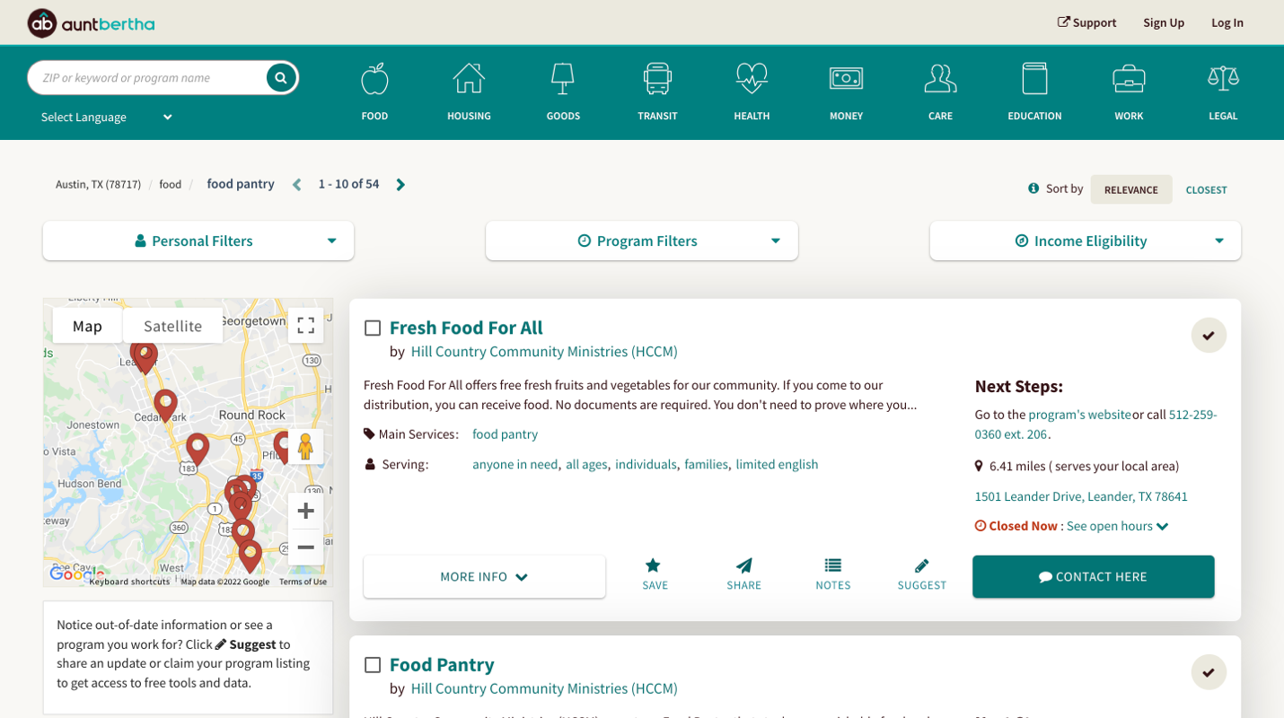
Since we weren’t adding new features or changing content – only the updating existing UI, instead of using Sketch or Figma to make images of updated pages, I used the Stylus Chrome extension to develop CSS rules that applied updated colors, fonts, and input styles as I viewed production pages in the browser, then I added those updated styles to the repository.
New Updated branding applied to homepageSearch result pages before (above) and after (below) updated styles applied
Additionally, I was responsible for evaluating the accessibility of our website and producing our company’s VPATs, resulting in minor adjustments to some of the colors marketing had selected to ensure proper contrast was maintained in all situations.
Summary
Good user interfaces may be visually appealing, but are not decorative. They're the connection between customers and our ability to serve their needs, and should present what’s needed, when it’s needed, and nothing more.
While color, form, content, and motion can be used to convey tone and a company’s brand, care must be taken not to burden customers with unnecessary visual information, freeing them to focus on what truly provides value.